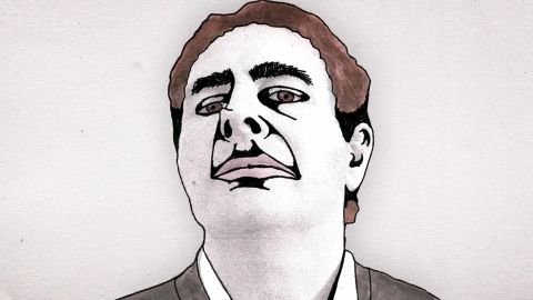
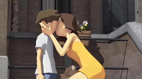
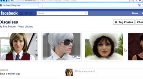
A Family Portrait
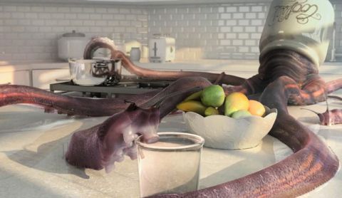
A family portrait goes horribly wrong as jealousy and suspicion bubble to the surfaceunder the photographer's relentless gaze. As the session reaches a disturbing conclusion,it's clear that this truly will be a day to remember.

Stash DVD Magazine (www.stashmedia.tv) is the monthly showcase for animation, VFX and motion graphics for the international design and advertising industry. Every edition is chockfull of ground-breaking commercials, broadcast design, music videos, virals, branded content, game cinematics, short animation films and background articles on software and technology. Stephen Price, chief editor of Stash Magazine, is our guide in the explosive supply. He selected two programmes featuring recent gems from Stash’s online archive, one with the best of 2011 and one with music videos. These TV commercials, music videos, virals, trailers, broadcast design and the occasional short self-promotional work offer an impressive cross section of current corporate animation. Powerful tools in combination with a clear vision and distinct pleasure in pushing boundaries yield a sparkling selection of recent productions.
A family portrait goes horribly wrong as jealousy and suspicion bubble to the surfaceunder the photographer's relentless gaze. As the session reaches a disturbing conclusion,it's clear that this truly will be a day to remember.
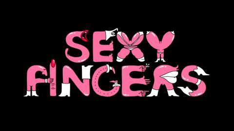
The clips for French charity AIDES always push the boundaries of NSFW, but this newest naughty animated viral film and Android application based on illustrations by Jean-Michel Tixier, will test the patience of even the most progressive-minded.
Elsa Rakotoson, producer at Frenzy, Paris: 'The main challenge of this project was to remain sexual and playful but not coarse and to find funny interactions for the video so it could work for the Android application and be interactive.'
Schedule: 'Two weeks to set up the ideas with the agency, get it validated by the client and set up the crew (animators, development, post-production). Then one month from approval until delivery.'
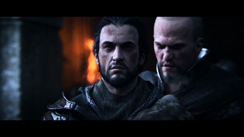
Producer Alex Sándor Rabb at the LA studios of Digic Pictures: 'Our assignment was create the 'final episode' of the Assassin's Creed series where the protagonist is obviously older and is facing the inevitable end, but we wanted to not only meet the expectations of the gamers (and the client, of course), but possibly exceed those expectations.
'The visualization of Altair's ghostly presence was one of the previously undecided issues that Ubisoft left to us to decide and resolve. In the story's first version (our version) Altair appeared a few more times, i.e., he was to pass undetected, but still be present during Ezio's travels. But after careful consideration these scenes were left out of the movie because they would have only confused the viewers and the story as well.
'Ubisoft's request was to see Altair as he recognizably distracts Ezio during the battle, so that Ezio gets into a disadvantage against the troop. Having this written in a brief makes it sound simple, but telling it through images is much harder – we had to try quite a few versions until we got to the final one.
'The obvious 'revelation' that Altair is just a ghost gets revealed only in the final scene as Altair walks out on the board parallel to Ezio. This was our creative input of note, something 'extra' we added to the movie, something that was an untold expectation by Ubisoft from us.
'In Altair's visualization our initial concept was to not reveal he was a ghost until the very end, so he wouldn't have appeared being so glorious and transparent in the movie. This concept was changed upon the conclusion of the feedback from the viewers of the test-screenings; many claimed that Altair's invisible presence made the storytelling hazy and the flow of occurrences confusing, therefore the story needed to be more unambiguous. We understood Ubisoft's concerns and changed the concept for the best.
'There are a lot of time-warps in the fighting scenes - at certain points with extremely slowed down motions - that posed a great technical challenge due to the large number of characters and numerous simulated elements. Also, the scene where we see Ezio on the sea made us face several problems, since our rendering pipeline went through a lot of changes lately and accordingly our previous tools that served us well before couldn't be used anymore.
'In asset creation we use Maya, 3ds Max, ZBrush, Bodypaint and Photoshop - the first two are supported by many in-house plug-ins. The scenes are assembled in Maya, the same software we use for animation. For rendering we use Arnold and the completed layers are 'polished together' in Nuke. It is very useful that the features of Maya are adjustable; we can broaden the variety of functions by adding or replacing the existing plug-ins with our own solutions, so we can say that Maya serves mainly to provide the technical framework in our pipeline. When we chose the software for rendering and compositing, the final decision was based upon the software's dependability and ability to perform robustly in a large-scale production environment.
'In the case of such a project we have to be extremely attentive to what the makers want to communicate to the gamers. It is not enough to only raise the interest for the game but to make the gamers want to play the game; each and every detail has to fit perfectly.
'In the past years we have experienced how incredibly precisely the gamers analyze our films upon their debut, and what sort of image they get about the product after having seen a trailer just a few minutes long. The approval process of a movie therefore is of key importance to the publisher and our aim is to do everything we can to entirely support them with it. The formation and development of a flexible workflow plays a huge role in that.'
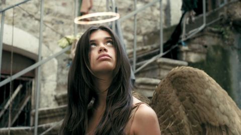
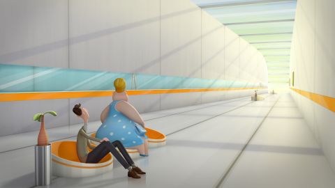
Blik is about a young boy who moves to a new neighbourhood and falls in love for the first time, with the much older girl next door.
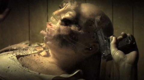
Chicago photographer Sandro Miller earns most of his notoriety for his striking portrait work. Lesser known, but just as impressive is his motion portfolio including this latest collaboration with John Malkovich who Millar has collaborated with for several years. The video will accompany 50 portraits of Malkovich Miller is shooting for a solo art show in Berlin in 2012.
'I was shooting this particular piece still and video simultaneously. We built the set in my studio, we lit the set the day before making sure our lighting would work with both still and video simultaneously.
'Challenges are always time and also to know that you must not over-direct a great actor like John. I set up the scenario talking John through my thoughts. The piece was to be dark and disturbing, a place I knew John could go to.
'You only need to put certain thoughts into John's head then let him take over. John is a master at understanding his character; it was only minutes and John was deep into the head of this sick character. Nobody is better at this than John. He also deeply understands camera angles and light, he knows his boundaries, he is a great listener and is passionate about every part he does. Even in our stills John goes deep into his character giving me every nuance of emotion that is in his body.
'Because it was a piece done for myself for the exhibition, we had time. I gave the work to Josh Bodnar at the Whitehouse and gave him all the time he needed to edit the piece. Josh then handed it off to Scholar with a month of time to complete the process.'
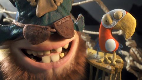
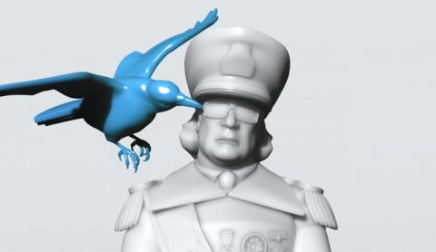
'Create something really cool.' With that four-word brief from Cartoon Network, Meindbender Animation Studio in Göteborg, Sweden were off and running on this spot to air across Europe, the Middle East and Africa.
Meindbender CD Olov Burman: 'In our earlier work we tried to keep everything simple, just one or two characters in a simple environment. But this time we went for a much more complex world: two characters on a moving boat, cloth fur, and water simulation in almost every shot.
'We had not worked with simulations much before and had to bring on experts in the different areas. The bent water surface proved to be very tricky, and in the end we simulated the water in a flat world that was then bent into place using a lattice.
'We wanted the characters to be animated in different styles. With the Parrot we went for a cartoony/2D kind of animation. With the Pirate, who is based on an upside down human mouth, we wanted a quite realistic animation style – almost like a puppet on your hand that you were acting with.
'A lot of work went into the Parrot rig, adjusting techniques we had used in earlier work for the parrot's '2D' way of moving. This included different sets of wings depending on his pose. Different meshes for the body, one with no mouth and one with mouth. Duplicate sets of eyes on the back of his head that we could un-hide when he turned his head, plus lots of squash and stretch controls.'
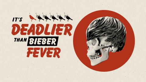
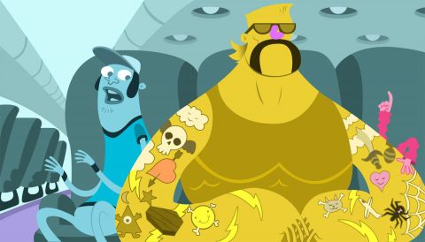
R. Kyle Shoup, CD at Foundation Content in Chicago on this viral companion to Steven Soderbergh's 'Contagion' feature film: 'The client asked us to create an informative piece based on their script with a very tongue-in-cheek, mock-educational feel in contrast to the serious drama of the movie. We were also asked to incorporate a number of funny memes from the internet as well as some mandatory visuals such as the Bieber Fever skull and the infamous honey badger.
'The main creative challenge was creating surprising and memorable visuals to accentuate the script without resorting to pure see-and-say. Although the piece is so fast-paced, presenting the audience with rapid-fire information, it had the potential of becoming monotonous, and the message would ultimately be lost.
'Sound design was also key to telling this story, and it was crucial to find a balance with sound and picture on such a crowded canvas. Selecting just the right mustache for our Spanish Virus was also extremely challenging.
'Originally intended for the web only, Warner Bros. loved it so much, they decided to include it on the 'Contagion' DVD release. You know you're working on something great when you find yourself laughing out loud at your own jokes.
Richard Scott, EP, Axis Animation, Glasgow: 'The key points of the brief were the trailer should feature normal people coming under attack at close quarters from zombies in a memorable fashion, that the zombie attack felt unstoppable, and they were not specially equipped or uncommonly proficient at dealing with this situation. We also had to get across a strong flavor of the Island Holiday resort where the game takes place. Above all we had to come up with something interesting, that was going to get people's attention.
'There were a number of technical challenges most of which revolve around creating realistic CGI characters that don't fall into the 'uncanny valley'. We cast real actors and captured their facial performance using 4D surface scanning rather than traditional optical marker techniques. That was the easy bit, the hard task for our Pipeline TD's was working out how we take that surface 3D data and drive our characters faces. We are delighted with those results.
'Another area that was technically challenging was using reverse slow motion. This threw up a whole additional set of considerations; for example we had to add full cloth simulation to all characters because the nature of that type of photography requires proper cloth sims to keep the clothes from looking stiff and fake.'
Schedule: 'We were in preproduction writing scripts, storyboarding and editing rough pre-vis for about two months. The full production took place over another five months.
'The trailer was launched as an exclusive announcement on IGN.com and from there just blew up. In the first 48 hours it generated two million Twitter posts, 1.7 million YouTube plays, 1.6 million IGN movie plays, 3 million IGN article views and was the ninth most searched term on Google. The trailer also got mainstream coverage in Wired, Forbes, LA Times, NY Post and the Guardian.
.jpg?format=w480)
Dvein: 'We were invited by the Spanish film director Kike Maíllo to create the main titles for his first feature film, a retro-futuristic sci-fi thriller.
'A project that began as a job turned nearly into a personal project due to the creative freedom and the confidence that the director gave us. We were very inspired by the whole aesthetic universe of the film: the snow, the vintage laboratories, the old machinery... and we tried to put all this together in the titles so that they would slowly introduce the viewers to the world of 'Eva'.
'We also wanted to reflect how one idea or thought of the consciousness influences others, as the movement of one gear affects the next one. This reminded us of clock machinery and also the operation of the steam engine.
'The choice of crystal came from the attraction that we felt for the contrast between something that's supposed to be metallic but which in fact is made with glass, something that adds also a sensitive, feminine and uncommon component to the machine world as we conceive it normally.
'It also reminded us of early 20th century laboratories, full of bottles and test tubes made of glass, something that not only worked well with the retro vibe of the film but also gave the feeling of experimentation and discovery, in a very romantic way.'
French international news channel France24 broadcasts in French, English and Arabic. During the Arab Spring of 2011 their coverage of the revolutions in Tunisia, Egypt and Libya drove broadcast audience numbers to record highs. But the real phenomenon was taking place via france24.com which experienced a peak in traffic with nearly 14 million visits and 59 million page views in March. Also, due to a steady stream of tweets dedicated to the Arab uprisings, France24 quintupled their followers on Twitter.
Based on these results and the events that drove them, France24 and its agency Marcel decided to highlight the link between freedom of information and freedom of expression on Internet.
Seoul studio Bread Communications adds performance art to a projection mapping project to create a powerful and engaging illusion they call Space Mapping for a live Hyundai event in Kuala Lumpur, Malaysia.
Wan Seob Lee, chair and producer at Bread Communications: 'As always, we wanted to create something never seen before, and we come up with this fun idea to not only project images on the wall but also hang the car on top of the wall and map it too.
'We used 3ds Max for all 3D work, After Effects for 2D composite and Inferno for final edit. For hardware we mixed two 30,000 ANSI projectors and four 20,000 ANSI projectors. It took six cranes to hang the car, the stunt man and all the equipment.'
Alan Smith & Adam Foulkes team up with The Bourne trilogy DOP Oliver Wood to drive home the power of Intel's new Core i5 processor.
Alan Smith: 'We often combine live action with animation within the same scene, but here we had to continually jump from one to the other without losing the impact of the action or interrupting the narrative thread. Instead of editing from scene to scene in live action, we would cut from software window to new software window.
'So we didn't get to shoot exploding cars on the streets of Prague, but who knows – maybe next time...'
We open on a moonlit country night and as the track “I’m a King Bee” by the Stone Foxes starts up, we are in no doubt that our hero is one cool bee. On an urgent mission, he flies through the forest at high speed until he finds what he’s been searching for - a bottle of Jack Daniel’s black label.
The story of a moth being drowned in natures complex cycles.
Santa Monica creative force Three Legged Legs casts a host of vibrant eccentrics and stuffs them into wide-bodied mayhem in this spot for Method Cleaners seen exclusively aboard Virgin America flights.
3LL: 'The agency had a pretty awesome script; there were a ton of wacky characters and personalities. We knew the key to this thing was going to be nailing those exaggerated stereotypes so that each character could make a huge impact without needing a lot of screen time.
'We felt pretty confident with our character control, but nailing the overall look and vibe turned out to be a little bit more challenging. Our initial exploration proved to be a little bit too candy-colored and over the top. A quick readjustment and we were more on the money. Taking aesthetic cues from the Method website gave us a minimal grey and blue backdrop over which was sprinkled the occasional splash of vibrant color.
'With the overall design aesthetic looking good and temp track in hand, we set about crafting the story. It was important there be a sense of building momentum within the cabin. The 'we're all in this together' message needs to spread willingly from person to person, until everyone is unified in the end. We went from a super quick, shitty-thumbnail doodle-fest, to a more elaborate After Effects animatic.
'Around the same time, we started bringing the animation muscle on board. We knew this thing needed a whopping dose of traditional animation, but the schedule and budget didn't allow for full on, straight-ahead goodness. We had to improvise...and improvise we did.
'The plan was to take one shot to final by the time we sent off the first pass animatic. The Loud Talkers shot seemed to have a little bit of everything needed to round out a typical shot. Here's how we broke it down :
Layout: Every shot needs a multi-planed background to nestle all the characters in their seats.
BG characters: The focus of this shot is the FG characters, so BG characters just need a still.
The loud talker ladies: Each character would need a traditionally animated head. For their bodies, we'd create a layered PSD to build a parented AE rig for the character.
The middle dude: A simple traditionally animated facial take would be animated. That's just the eyes and mouth, to save on drawing time. The entire body and nose would be a single piece of artwork.
'Our original plan: traditional animation in Flash, still art in Illustrator. Boy did that change. As we went through look development, everyone was feeling the wonkier hand-drawn feel. Goodbye Illustrator. As we talked through the pipeline process with our new animator buddy Ben, he suggests, 'Just do it ALL in Photoshop.' With a flurry of keystrokes, the animation timeline was opened, and we were animating - right there - all in one program. ZOMG.
'It was a little slow at first, and the PS timeline is super NOT intuitive. But once you get over the obvious missing features, it's pretty sweet. It definitely simplified our lives.
'Not to spoil any secrets here, but we're not doing anything particularly fancy in this project. The puppet tool was our greatest ally. As an extra bit of stylistic whiz bang (mostly to hide our limitations), we created a '2line' asset for every piece of art that was to be animated.
'That means, tracing every piece of flat work twice so there's a little bit of wobble in the line work. We held these alternating drawings on 4's so it didn't get too flashy. As we animated our parent/puppet tool rigs, we de-smoothed the animation so it held on 2's to give it more of a limited animation look and feel.
'Everyone loved the look. Success! At the end of the day, we think we netted out with a nice simplified animation style that combined the best qualities of traditional animation with the best qualities of AE character animation, without sacrificing anything. That's just our humble opinion. As with any project, once all of this was figured out, it was just a matter of plugging away and knocking out shot after shot.'
.jpg?format=w480)
Sune Reinhardt, co-director on this student film created at The Animation Workshop in Viborg, Denmark: 'The genre: magical realism, satire, hyper violence. The style: animated graphic novel. The themes: aggressive depression, nihilism - values do not exist, unexpected challenges – getting struck by lightning.
'Initial inspiration/influences: 'Duel' (1971 Spielberg film), 'North by Northwest' (1959 Alfred Hitchcock film (crop-duster standoff-scenario)), 'The Twilight Zone' (American anthology series from 1959 – notably episode: 'The Hitch Hiker'), Guy Ritchie (director – editing and style during fight scenes – 'hyper violence'/caricatured violence), 'Fight Club' (themes and views on anarchy in a mind beyond desperation)
'The story/hook: A man self-proclaiming to be careless learns a poetic lesson when he drives his car into a deer, which manifests as a human with antlers, intending to destroy the driver and his car.'
Animator and co-directors Bertrand Avril, Pierre Chomarat, David Dangin and Thea Matland at the Supinfocom campus in Arles, France: 'We didn't have a brief as it was a school graduation project. But the pitch we created is: While his wife is undergoing slimming treatment, André goes on a discovery tour of this very unusual center...
'From the beginning we wanted to have a Jacques Tati feeling in this film. So we analyzed a lot his films like 'Playtime' and 'My Uncle'.
'We had to think carefully about the framing and the rhythm. As the shots are often quite long, we had to guide the eye of the audience to concentrate on the important actions. The masculine character, André, was the best way to achieve that. As we follow him, the narration goes through the amused look of this character.
'The main challenge was the length of the film and the number of characters we had in each shot. So the hostesses were rigged with Biped which lacks flexibility but it has great features to copy and multiply animation cycles, and to install each character on a path. It was very helpful for the wide angle shots.
'All the other characters had their own rig to deal with their own specifics. Thanks to Elsa Brehin (a classmate), and her scripts, we had the possibility to copy animations from a character to another one. It was really time saving.'
Schedule: 'The original idea from David was presented in February when he started working on the design and the global aesthetic. In May we started working full time on the project; we wrote the story together and started the storyboard, continuing to work on the world of Slimtime. In July we had the first 2D animatic and took some holidays. We restarted work on the film in September with the 3D animatic that we finished in December. At the same time David and Thea did the character modeling, when Pierre did the environment modeling and Bertrand the lightboard and the rigging. After that we started working seven days a week to finish the film for the jury on July 8th.
'We had four workstations with 3ds Max 2010, V-Ray, and the Adobe Suite. For the renders, we used Backburner on the other workstations of Supinfocom's network, shared with all the other films from our class.'
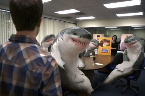
James Razzall, EP at Framestore in NY: 'The director Jim Jenkins and BBDO both wanted to push the realism of the sharks as much as possible. But there were also fears it could look too scary. We mocked up some ideas for the shark look which also helped us figure out posture and how these things could sit at a table. I think we all felt that once the sharks start talking and animating that the realism of their look would be countered by that and so take the edge off the overall scariness.
'The animation was key. People aren't used to seeing sharks in a human world, so to have them move in a believable manner, while still being bound by their own physiology and perform was a challenge. Although the lighting environment was constant, and quite flat, it threw up challenges to get an interesting look from the sharks. Again we're used to seeing them underwater, so to be in an office environment is very alien.
'We worked with creating a believable skin texture, while adding reflective details to make them feel slightly wet. On the shoot we took our usual HDRI lighting reference, camera information and measurements in order to accurately recreate the scene in the computer – we also had one of our 'runners' nip down to Canal Street and buy a dead dog-fish. It was a very smelly, but useful on-set reference.
'After 3D worked their magic we had reflections and shadows on the table and the water in the glasses wobbling to sit these huge sharks into the scene. The back plates had a lot of cleanup and we had a huge mirror at the back of the room which appeared in almost every shot, this wasn't necessarily a technical challenge just more work.'
One of this year's most visually arresting and graphically relevant spots, 'Dirty Water' was drawn, performed and directed by Clément Beauvais, a young French filmmaker, illustrator, musician and photographer.
The campaign urges journalists to spread awareness of the fact disease caused by unfit drinking water is the world's leading cause of death and appeals to readers to sign a petition at votregouttedeau.org.
Arthur de Kersauson, producer at Hush in Paris: 'The client wanted to find a way to make ink and water interact to raise awareness of the dirty water problem. The main creative challenge was to find symbols that could be drawn with water because very few things can be drawn using this technique. We also had to try lots of different papers and inks to find the best match to control the diffusion process.
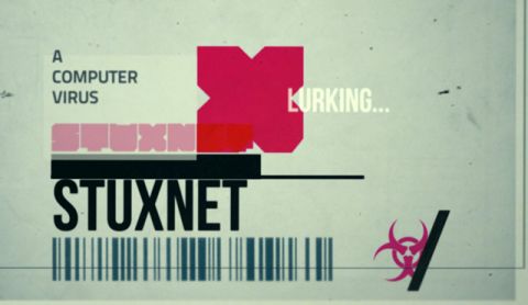
Patrick Clair, director/motion designer, Sydney, Australia: 'This segment was produced for an Australian television documentary series called HungryBeast that covers the intersection of culture, war, technology and politics.
'Usually for these segments we use some kind of template or pre-planned approach. However, this time we wanted to aim for a different aesthetic that required a more modular and complex build.
'We constantly revised our cut and approach by assembling iterations of each sequence in the edit. Our main concern was audience fatigue. It can be hard to just watch graphics flying at you for such a long period and still take in the information. We tried to maintain a balance through the piece whereby we kept up the energy without overloading the audience.
'We didn't have the time for long 3D renders so we had to find shortcuts to get the most out of our sequences. The microscope, which features in about 15 seconds of the clip, is actually the same animation rendered from three different cameras. For the 45-second infographic featuring the Washington, UN and Iran nodes we only rendered 10 seconds of 3D and then paused our 3D render at each node and animated additional text in after effects. For the wireframes we just treated HD playblasts straight from Maya, allowing for a rapid addition of 3D elements when needed.'
Dvein enlists fellow Barcelonians Vando Studio and Furia Digital to construct this visual metaphor for how incredibly destructive termites really are. 'Initially, the storyline was about monsters flying over a town, turning into termites. But then we thought 'Why not show monsters causing direct damage to the houses?' The agency fully supported this idea and we developed it further with them.
'The monster design was our first challenge: developing a 3D creature away from the typical blockbuster, high-budget movies; we needed to create a characteristic identity that distinguished the commercial, that made it atypical.
'We decided to work with real land animals who are massive, like buffalos and elephants in a stampede, but which can also fly. We were searching for something unexpected and at the same time it had to have the insects features, but magnified.
'The idea was building a collage of attitudes, forms and textures that were also the projection of a termite's modus operandi. At the same time, our ideas had to go in the same direction as the client's, but without losing the organic forms of Dvein's signature.
'Once every monster was finished, we got into the animation process. Our main aim was to translate truthfully every detail of the monster into movement, transmitting the fast and action-packed rhythm of the commercial. We had only 10 seconds to show the monsters' capacity to fly, but also to destruct. The destruction feeling was very important, not only in the way that the monsters destroyed the houses but in the way the houses rupture.
'At the same time, we didn't want to lose the modeling and texturing details, so we chose to have a slow-motion sequence, that allows appreciating those details but at the same time adds drama to the story. Dynamics simulation tools as well as manual animation were required to achieve this.
'We were also very accurate in choosing the framing. We wanted to amplify the sensation of weight and clearly appreciate the anatomy of the monsters so we had to locate the cameras in strategic points to give the whole scene a deeper realism.
'In the second commercial we wanted to focus on the termites' most specific and basic feature: they eat. They eat a lot, especially wood. For this reason, we worked specifically with the mouth, almost a mouth with legs, but which also had saw characteristics.'
Kaboom Animation Festival is the one-stop-shop for the latest and greatest in all things animated. Ranging from cutting-edge experimental arthouse to colorful stories for families and kids, Kaboom will cater to the animation needs of all. Yes, even yours, my amazing weirdo friend!
© 2026. Website by Have a Byte!


")


